
Closing in on Tailwind CSS v1.0
Originally I had planned on a February release for Tailwind CSS v1.0, but I didn't anticipate just how long it would take to simply make decisions about things like the new config file format, renaming some existing classes, or the naming scheme for the new color palette.
It turns out actually writing the code is the easy part, deciding what code to write is the challenge.
I think the bulk of the paralyzing decisions are behind me at this point though, and I'm hoping to get 1.0.0-alpha.0 out today (!) so people can start trying it out while I make a few final adjustments and crank out the documentation.
The last two weeks have been pretty productive and I banged out a ton of stuff for v1.0, here are most of the highlights...
Make Flexbox features more configurable
In 0.x, all of the Flexbox-related features in Tailwind are lumped together into a single "flexbox" module/plugin.
In 1.0, every Flexbox feature will get its own plugin (#689), for two reasons:
- Some Flexbox features apply to CSS Grid as well (
align-items,justify-content, etc.), so categorizing those properties underflexboxwill feel incorrect when we add grid support. - It would be useful to be able to customize certain Flexbox properties that accept user-defined values (like
flex,flex-grow, andflex-shrink), so it would be nice if those properties had their own key in thethemeconfiguration.
This means that instead of customizing the variants for all Flexbox utilities at once using a single flexbox key in the variants section of your config, you can now control each one individually using the separate plugin names: flexDirection, flexWrap, alignItems, alignSelf, justifyContent, alignContent, flex, flexGrow, and flexShrink.
I also added new theme sections for flexGrow, flexShrink, and flex, so you can customize those values if needed, instead of being limited to the default values (#690, #700).
That means if you've ever needed flex-grow-2, you can easily add it through your config instead of creating a custom utility:
module.exports = {
  extend: {
    theme: {
      flexGrow: {
        2: 2,
      }
    }
  }
}
To make the class names more predictable after adding customization support, I had to rename flex-no-grow to flex-grow-0 and flex-no-shrink to flex-shrink-0 (#687) which is unfortunately a breaking change, but I think ultimately for the best.
Added new default box shadows
The default shadows we include in 0.x are okay, but since the approach for v1.0 is to encourage people to rely on the defaults and only customize when necessary, it's important that we make the v1.0 shadows kick ass.
Steve and I learned a lot about crafting really great shadows when writing Refactoring UI, so we spent a couple of days applying those ideas to create some new shadows for v1.0 (#691.
Here's where we ended up:
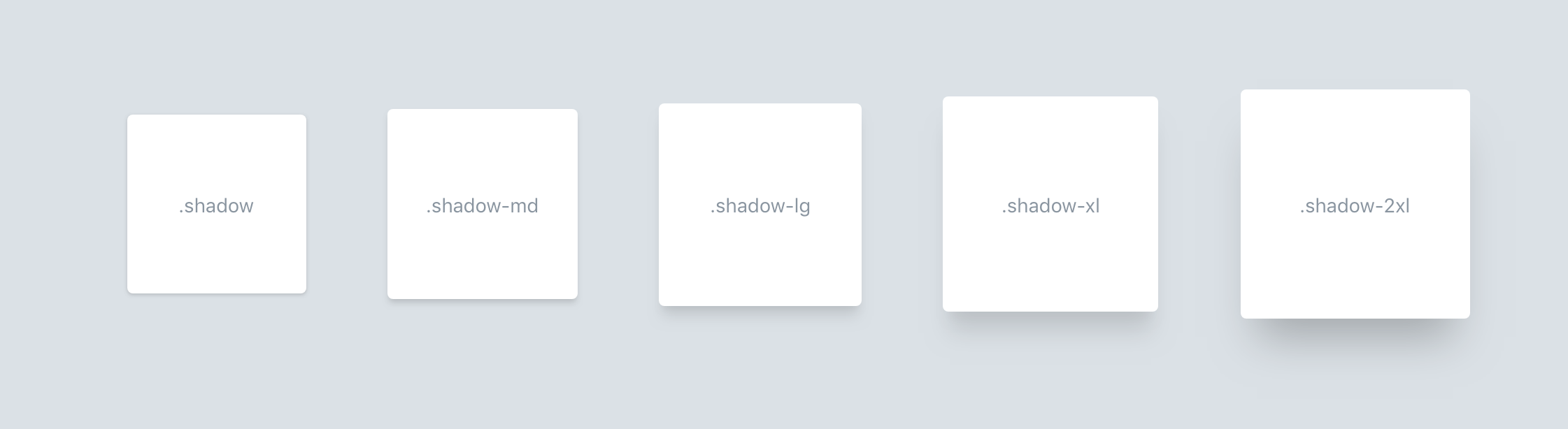
Check out a live demo on CodePen.
The new shadows incorporate a progressively larger negative spread value to better convey elevation, and I think they look super pro.
Simpler escape handling
Back in January I wrote about how I was hoping to leverage some new built-in escape handling functionality in postcss-selector-parser to simplify our own escape handling, but couldn't because of an annoying bug in css-loader.
While the actual bug hasn't been resolved, the latest version of postcss-selector-parser makes it possible for me to work around it, so I decided to give this another go.
Ultimately I was able to remove our dependency on css.escape and defer all escape handling to postcss-selector-parser (#694), which is nice because now all escaping happens through the same code path and nothing can get out of sync.
This also prompted me to revisit how we were dealing with escaping in plugins that add new variants to Tailwind. In 0.x, plugin authors didn't need to really worry about escaping when adding variants, but did when adding utilities.
This was only possible by us naively escaping segments of class names in isolation, which is sort of a bad idea because it could lead to unnecessary (though harmless) escape sequences.
So in v1.0, I've decided that plugin authors will need to escape class names themselves using the e helper (#695), just like they do with utilities.
  function({ addVariant, e }) {
    addVariant('first-child', ({ modifySelectors, separator }) => {
      modifySelectors(({ className }) => {
-       return `.first-child${separator}${className}:first-child`
+       return `.${e(`first-child${separator}${className}`)}:first-child`
      })
    })
  },
It's a tiny bit more work for plugin authors, but at least the plugin authoring experience is now consistent.
Treat theme as source of truth for all plugin configuration
This is more of a philosophical change than a real code change, but in earlier drafts of v1.0, core plugins were configured by Tailwind from the outside. Internally, Tailwind would load up each core plugin, find a matching key in the theme and variants sections of the config, and pass those values directly to the plugin as arguments.
This was fine for core plugins, but the philosophy of "plugins should be configured directly" put third-party plugins at a disadvantage when it came to things like loading up all of your theme values as a JS module, or extending a base theme.
The reason is that if a third-party plugin is configured directly, like this:
module.exports = {
  // ...
  plugins: [
    require('my-gradient-plugin')({
      gradients: {
        'blue-green': [colors['blue'], colors['green']],
        'purple-blue': [colors['purple'], colors['blue']],
        // ...
      },
      variants: ['responsive', 'hover'],
    })
  ],
  // ...
}
...there's no way to access the configuration values anywhere else, because they are inlined and effectively "swallowed up" by the plugin function.
I talked about this problem with Brad Cornes (the wizard behind the Tailwind CSS IntelliSense plugin) and he convinced me that a better approach would be for all plugins to reach into the theme and grab the values they need themselves, rather than being configured explicitly.
It sounds like a bad idea intuitively (why introduce weird indirection that relies on matching up two strings if you don't have to), but in practice it's a lot more practical.
Basically, the recommendation now is that plugins read their config from the theme section, and plugin authors simply document what key(s) they are going to look for.
So the plugin above would instead be configured like this:
module.exports = {
  // ...
  theme: {
    // ...
    gradients: {
      'blue-green': [colors['blue'], colors['green']],
      'purple-blue': [colors['purple'], colors['blue']],
      // ...
    },
  },
  variants: {
    // ...
    gradients: ['responsive', 'hover'],
  },
  plugins: [
    require('my-gradient-plugin'),
  ],
  // ...
}
This way if you ever wanted to bundle up a customized theme that depended on a plugin, end users could still extend those values using the same mechanisms they are already used to.
All of Tailwind's core plugins have been updated to work this way internally ((#696)), and I'll be updating the documentation when I release v1.0 to reflect this new best practice, as previously I was encouraging the exact opposite.
This change doesn't actually affect any end-users of Tailwind, but will impact how plugin authors write their plugins if they want to follow our guidelines.
Renamed config() to theme()
In Tailwind 0.x, the config() function could be used in your actual CSS to reference values from the config, for example:
.shadow-red {
  box-shadow: 0 0 3px config('colors.red');
}
This is useful as an escape hatch instead of @apply when you need to reference something from your config as part of a property declaration rather than the whole declaration.
But since v1.0 moves all of the theme-related configuration into the theme key, you'd have to write the above example like this:
.shadow-red {
  box-shadow: 0 0 3px config('theme.colors.red');
}
I couldn't think of a single reason why someone would ever want to reference top-level options like prefix in their CSS, so I decided to rename the function to theme() and automatically scope it to the theme key (#697):
.shadow-red {
  box-shadow: 0 0 3px theme('colors.red');
}
It feels like a much more expressive name anyways.
Extended spacing scale
When I introduced the shared spacing key under theme, I updated width and height to use that scale as well so everything would be easy to update in one place, but width and height had some additional larger values (40, 48, and 64) that were not part of the spacing scale and needed to be included separately.
To unify the entire scale, I decided to add those missing values to spacing so they would be available to padding and margin as well (#699).
I also added 56 to the scale because it felt like a bit of a hole that might be useful for sizing larger components like dropdowns (#698).
Added new progressive maxWidth scale
In 0.x our default maxWidth scale was sort of an afterthought — we just started at 20rem and bumped it up by 10rem at a time until it felt like there were a decent number of options.
In hindsight we should have agonized over this a little more, because the max-width utilities are some of the most important layout tools in the entire framework; they are crucial for sizing larger blocks in situations where it doesn't make sense to follow a grid, like a large centered card for example.
The big mistake in the original scale was increasing the size linearly. Just like a type scale or spacing scale, it makes a lot more sense for the lower values to be clustered closer together, and for the gap to progressively increase as you get to larger sizes.
After a bunch of experimentation, Steve and I landed on a set of values we think are pretty solid (#701). The scale goes from 20rem to 72rem, with the values at the low end being only 4rem apart, and the values at the high end being 8rem apart.
Check out a demo of the new scale on CodePen.
Making Preflight more aggressive
Something that bites me personally all the time is accidentally relying on user-agent styles that don't match values in my config file. For example, creating an h1 and not assigning an explicit font size, or creating an input and not assigning it a text color.
So something I'm trying to improve in v1.0 is making it as hard as possible to accidentally use styles that deviate from your system.
The first step was to reset heading styles by default, so all headings default to the base font size (#703). This means that by default all headings are the same size. This might sound unhelpful at first, but I think it's much better for a heading to be obviously the wrong size and trigger you to assign it a size than it is for it to look like almost the right size, but actually not be a size in your type scale.
A lot of the time, text that is semantically a heading shouldn't actually be large and emphasized anyways.
This week I'm going to looking for more opportunities to make Preflight more helpful in this space, starting with resetting font properties on buttons and inputs (#741).
Finalizing the new color palette
Steve has spent the last two weeks working on the new color palette for v1.0, and I think we're getting pretty close.
We decided to jump from 7 shades per color to 9, and are using a numeric scale borrowed from Material Design, where 100 is the lightest shade, and 900 is the darkest.
We're still in the process of fine-tuning things, but I've opened a PR (#737) that at least introduces the new naming scheme and previews where we are at with the palette:

I'll likely ship 1.0.0-alpha.0 with the draft palette, and Steve and I will continue to refine it and test it in real UIs before we tag the final 1.0.
We're also planning to create a bunch of additional colors that are equally balances and harmonious but aren't enabled by default, so you can easily pull those in if you need them for your project. One of the most common questions we get is "how do a generate a set of shades for my own custom base color?" so we're hoping to help solve that problem by eventually having a library of dozens of base colors to choose from that all have 9 pre-selected shades.
You'll be able to pull them into your project by doing something like this:
const colors = require('@tailwindcss/colors')
module.exports = {
  theme: {
    colors: {
      gray: colors.coolGray,
      blue: colors.lightBlue,
      red: colors.crimson,
      green: colors.forestGreen
    }
  }
}
This will be possible thanks to another feature I recently added (#707), where you can now specify colors using an object syntax like this:
const colors = require('@tailwindcss/colors')
module.exports = {
  theme: {
    colors: {
      gray: {
        100: '#eee',
        300: '#ccc',
        500: '#999',
        700: '#555',
        900: '#222',
      }
    }
  }
}
Other updates
- I gave a talk called "Tailwind CSS by Example" at Laracon Online. I spent just over an hour taking a design Steve created in the talk directly before mine and built it out with Tailwind, narrating the process and explaining my decisions. People seemed to enjoy it and it was a lot of fun.
- I was interviewed about Tailwind on JS Party. Jerod and Adam from The Changelog had me on their JS Party show to talk all about the philosophy behind Tailwind and what's coming in v1.0. Give it a listen if that sounds interesting to you, was probably my favorite Tailwind interview I've done.
- Released a new Full Stack Radio episode about Tailwind CSS v1.0. This was super fun, my friend Sam Selikoff came on the show to basically act as the interviewer and we did a super deep dive into what I've been working on. Probably nothing new if you follow this journal, but check it out if you want the whole story in one place.
- I live-streamed some work on a potential Tailwind feature. I spent about 45 minutes hacking on making it possible to watch additional files for changes when you have webpack building your CSS. Hope to polish this off in a future point release, should make it a lot easier to split your config file up into multiple files without losing the ability to watch them for changes.
- Launched pre-orders for Full Stack Radio shirts and stickers. Been meaning to do this for ages, finally got everything sorted out and posted. $35 (including free shipping worldwide) for a ridiculous death-metal-themed Full Stack Radio shirt and pack of stickers (including a Tailwind sticker). Going to lose money on this 100% but still thought it would be fun, grab one now if you're interested as I'll probably never do it again.
Next
- Release 1.0.0-alpha.0. Was hoping to do that today but it's already 1:15pm so might be tomorrow.
- Really get started on the updated documentation. I still need to port the docs site to VuePress and write all of the updated docs. This is going to be a big job but hopefully can put a serious dent in it this week and have it finished by the end of next week so I can properly launch v1.0.
- Tackle a few remaining small features/changes. I still have a handful of things to get through in the code department, but I think I'm past all of the really hard stuff. You can keep up with where I'm at on my public to-do list.