Over the last several years, the way I write CSS has transitioned from a very "semantic" approach to something much more like what is often called "functional CSS."
Writing CSS this way can evoke a pretty visceral reaction from a lot of developers, so I'd like to explain how I got to this point and share some of the lessons and insights I've picked up along the way.
Phase 1: "Semantic" CSS
One of the best practices you'll hear about when you're trying to learn how to CSS good is "separation of concerns."
The idea is that your HTML should only contain information about your content, and all of your styling decisions should be made in your CSS.
Take a look at this HTML:
<p class="text-center">
    Hello there!
</p>
See that .text-center class? Centering text is a design decision, so this code violates "separation of concerns" because we've let styling information bleed into our HTML.
Instead, the recommended approach is to give your elements class names based on their content, and use those classes as hooks in your CSS to style your markup:
<style>
.greeting {
    text-align: center;
}
</style>

<p class="greeting">
    Hello there!
</p>
The quintessential example of this approach has always been CSS Zen Garden; a site designed to show that if you "separate your concerns", you can completely redesign a site just by swapping out the stylesheet.
My workflow looked something like this:
Write the markup I needed for some new UI (an author bio card in this case):
<div>
  <img src="https://cdn-images-1.medium.com/max/1600/0*o3c1g40EXj65Fq9k." alt="">
  <div>
    <h2>Adam Wathan</h2>
    <p>
      Adam is a rad dude who likes TDD, Active Record, and garlic bread with cheese. He also hosts a decent podcast and has never had a really great haircut.
    </p>
  </div>
</div>
Add a descriptive class or two based on the content:
- <div>
+ <div class="author-bio">
    <img src="https://cdn-images-1.medium.com/max/1600/0*o3c1g40EXj65Fq9k." alt="">
    <div>
      <h2>Adam Wathan</h2>
      <p>
        Adam is a rad dude who likes TDD, Active Record, and garlic bread with cheese. He also hosts a decent podcast and has never had a really great haircut.
      </p>
    </div>
  </div>
Use those classes as "hooks" in my CSS/Less/Sass to style my new markup:
.author-bio {
  background-color: white;
  border: 1px solid hsl(0,0%,85%);
  border-radius: 4px;
  box-shadow: 0 2px 4px rgba(0,0,0,0.1);
  overflow: hidden;
  > img {
    display: block;
    width: 100%;
    height: auto;
  }
  > div {
    padding: 1rem;
    > h2 {
      font-size: 1.25rem;
      color: rgba(0,0,0,0.8);
    }
    > p {
      font-size: 1rem;
      color: rgba(0,0,0,0.75);
      line-height: 1.5;
    }
  }
}
Here's a demo of the final result:
See the Pen "Semantic" mapping layer (terrible idea!) by Adam Wathan (@adamwathan) on CodePen.
This approach intuitively made sense to me, and for a while this is how I wrote HTML and CSS.
Eventually though, something started to feel a bit off.
I had "separated my concerns", but there was still a very obvious coupling between my CSS and my HTML. Most of the time my CSS was like a mirror for my markup; perfectly reflecting my HTML structure with nested CSS selectors.
My markup wasn't concerned with styling decisions, but my CSS was very concerned with my markup structure.
Maybe my concerns weren't so separated after all.
Phase 2: Decoupling styles from structure
After looking around for a solution to this coupling, I started finding more and more recommendations towards adding more classes to your markup so you could target them directly; keeping selector specificity low and making your CSS less dependent on your particular DOM structure.
The most well-known methodology that advocates this idea is Block Element Modifer, or BEM for short.
Taking a BEM-like approach, the markup for our author bio might look more like this:
<div class="author-bio">
  <img class="author-bio__image" src="https://cdn-images-1.medium.com/max/1600/0*o3c1g40EXj65Fq9k." alt="">
  <div class="author-bio__content">
    <h2 class="author-bio__name">Adam Wathan</h2>
    <p class="author-bio__body">
      Adam is a rad dude who likes TDD, Active Record, and garlic bread with cheese. He also hosts a decent podcast and has never had a really great haircut.
    </p>
  </div>
</div>
...and our CSS would look like this:
.author-bio {
  background-color: white;
  border: 1px solid hsl(0,0%,85%);
  border-radius: 4px;
  box-shadow: 0 2px 4px rgba(0,0,0,0.1);
  overflow: hidden;
}
.author-bio__image {
  display: block;
  width: 100%;
  height: auto;
}
.author-bio__content {
  padding: 1rem;
}
.author-bio__name {
  font-size: 1.25rem;
  color: rgba(0,0,0,0.8);
}
.author-bio__body {
  font-size: 1rem;
  color: rgba(0,0,0,0.75);
  line-height: 1.5;
}
This felt like a huge improvement to me. My markup was still "semantic" and didn't contain any styling decisions, and now my CSS felt decoupled from my markup structure, with the added bonus of avoiding unnecessary selector specificity.
But then I ran into a dilemma.
Dealing with similar components
Say I needed to add a new feature to the site: displaying a preview of an article in a card layout.
Say this article preview card had a full bleed image on the top, a padded content section below, a bold title, and some smaller body text.
Say it looked exactly like an author bio.
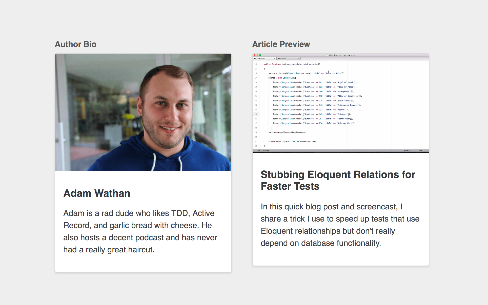
What's the best way to handle this while still separating our concerns?
We can't apply our .author-bio classes to our article preview; that wouldn't be semantic. So we definitely need to make .article-preview its own component.
Here's what our markup could look like:
<div class="article-preview">
  <img class="article-preview__image" src="https://i.vimeocdn.com/video/585037904_1280x720.webp" alt="">
  <div class="article-preview__content">
    <h2 class="article-preview__title">Stubbing Eloquent Relations for Faster Tests</h2>
    <p class="article-preview__body">
      In this quick blog post and screencast, I share a trick I use to speed up tests that use Eloquent relationships but don't really depend on database functionality.
    </p>
  </div>
</div>
But how should we handle the CSS?
Option 1: Duplicate the styles
One approach would be to straight up duplicate our .author-bio styles and rename the classes:
.article-preview {
  background-color: white;
  border: 1px solid hsl(0,0%,85%);
  border-radius: 4px;
  box-shadow: 0 2px 4px rgba(0,0,0,0.1);
  overflow: hidden;
}
.article-preview__image {
  display: block;
  width: 100%;
  height: auto;
}
.article-preview__content {
  padding: 1rem;
}
.article-preview__title {
  font-size: 1.25rem;
  color: rgba(0,0,0,0.8);
}
.article-preview__body {
  font-size: 1rem;
  color: rgba(0,0,0,0.75);
  line-height: 1.5;
}
This works but of course it's not very DRY. It also makes it a bit too easy for these components to differ in slightly different ways (maybe a different padding, or font color) which can lead to an inconsistent looking design.
Option 2: @extend the author bio component
Another approach is to use the @extend feature of your preprocessor of choice; letting you piggy-back off of the styles already defined in our .author-bio component:
.article-preview {
  @extend .author-bio;
}
.article-preview__image {
  @extend .author-bio__image;
}
.article-preview__content {
  @extend .author-bio__content;
}
.article-preview__title {
  @extend .author-bio__name;
}
.article-preview__body {
  @extend .author-bio__body;
}
Using @extend at all is generally not recommended, but that aside, this feels like it solves our problem right?
We've removed the duplication in our CSS, and our markup is still free of styling decisions.
But let's examine one more option...
Option 3: Create a content-agnostic component
Our .author-bio and .article-preview components have nothing in common from a "semantic" perspective. One is the bio of an author, the other is a preview of an article.
But as we've already seen, they have a lot in common from a design perspective.
So if we wanted to, we could create a new component named after what they do have in common, and reuse that component for both types of content.
Let's call it a .media-card.
Here's the CSS:
.media-card {
  background-color: white;
  border: 1px solid hsl(0,0%,85%);
  border-radius: 4px;
  box-shadow: 0 2px 4px rgba(0,0,0,0.1);
  overflow: hidden;
}
.media-card__image {
  display: block;
  width: 100%;
  height: auto;
}
.media-card__content {
  padding: 1rem;
}
.media-card__title {
  font-size: 1.25rem;
  color: rgba(0,0,0,0.8);
}
.media-card__body {
  font-size: 1rem;
  color: rgba(0,0,0,0.75);
  line-height: 1.5;
}
...here's what the markup for our author bio would look like:
<div class="media-card">
  <img class="media-card__image" src="https://cdn-images-1.medium.com/max/1600/0*o3c1g40EXj65Fq9k." alt="">
  <div class="media-card__content">
    <h2 class="media-card__title">Adam Wathan</h2>
    <p class="media-card__body">
      Adam is a rad dude who likes TDD, Active Record, and garlic bread with cheese. He also hosts a decent podcast and has never had a really great haircut.
    </p>
  </div>
</div>
...and here's the markup for our article preview:
<div class="media-card">
  <img class="media-card__image" src="https://i.vimeocdn.com/video/585037904_1280x720.webp" alt="">
  <div class="media-card__content">
    <h2 class="media-card__title">Stubbing Eloquent Relations for Faster Tests</h2>
    <p class="media-card__body">
      In this quick blog post and screencast, I share a trick I use to speed up tests that use Eloquent relationships but don't really depend on database functionality.
    </p>
  </div>
</div>
This approach also removes the duplication from our CSS, but aren't we "mixing concerns" now?
Our markup all of a sudden knows that we want both of these pieces of content to be styled as media cards. What if we wanted to change how the author bio looked without changing how the article preview looks?
Before, we could just open up our stylesheet and choose new styles for either of the two components. Now we'd need to edit the HTML! Blasphemy!
But let's think about the flip side for a minute.
What if we needed to add a new type of content that also needed the same styling?
Using a "semantic" approach, we'd need to write the new HTML, add some content-specific classes as styling "hooks", open up our stylesheet, create a new CSS component for the new content type, and apply the shared styles, either through duplication or using @extend or a mixin.
Using our content-agnostic .media-card class, all we'd need to write is the new HTML; we wouldn't have to open the stylesheet at all.
If we're really "mixing concerns", shouldn't we need to make changes in multiple places?
"Separation of concerns" is a straw man
When you think about the relationship between HTML and CSS in terms of "separation of concerns", it's very black and white.
You either have separation of concerns (good!), or you don't (bad!).
This is not the right way to think about HTML and CSS.
Instead, think about dependency direction.
There are two ways you can write HTML and CSS:
~~"Separation of Concerns"~~ CSS that depends on HTML.
Naming your classes based on your content (like
.author-bio) treats your HTML as a dependency of your CSS.The HTML is independent; it doesn't care how you make it look, it just exposes hooks like
.author-biothat the HTML controls.Your CSS on the other hand is not independent; it needs to know what classes your HTML has decided to expose, and it needs to target those classes to style the HTML.
In this model, your HTML is restyleable, but your CSS is not reusable.
~~"Mixing Concerns"~~ HTML that depends on CSS.
Naming your classes in a content-agnostic way after the repeating patterns in your UI (like
.media-card) treats your CSS as a dependency of your HTML.The CSS is independent; it doesn't care what content it's being applied to, it just exposes a set of building blocks that you can apply to your markup.
Your HTML is not independent; it's making use of classes that have been provided by the CSS, and it needs to know what classes exist so that it combine them however it needs to to achieve the desired design.
In this model, your CSS is reusable, but your HTML is not restyleable.
CSS Zen Garden takes the first approach, while UI frameworks like Bootstrap or Bulma take the second approach.
Neither is inherently "wrong"; it's just a decision made based on what's more important to you in a specific context.
For the project you're working on, what would be more valuable: restyleable HTML, or reusable CSS?
Choosing reusability
The turning point for me came when I read Nicolas Gallagher's About HTML semantics and front-end architecture.
I won't reiterate all of his points here, but needless to say I came away from that blog post fully convinced that optimizing for reusable CSS was going to be the right choice for the sorts of projects I work on.
Phase 3: Content-agnostic CSS components
My goal at this point was to explicitly avoid creating classes that were based on my content, instead trying to name everything in a way that was as reusable as possible.
That resulted in class names like:
.card.btn,.btn--primary,.btn--secondary.badge.card-list,.card-list-item.img--round.modal-form,.modal-form-section
...and so on and so forth.
I noticed something else when I started focusing on creating reusable classes:
The more a component does, or the more specific a component is, the harder it is to reuse.
Here's an intuitive example.
Say we were building a form, with a few form sections, and a submit button at the bottom.
If we thought of all of the form contents as part of a .stacked-form component, we might give the submit button a class like .stacked-form__button:
<form class="stacked-form" action="#">
  <div class="stacked-form__section">
    <!-- ... -->
  </div>
  <div class="stacked-form__section">
    <!-- ... -->
  </div>
  <div class="stacked-form__section">
    <button class="stacked-form__button">Submit</button>
  </div>
</form>
But maybe there's another button on our site that's not part of a form that we need to style the same way.
Using the .stacked-form__button class on that button wouldn't make a lot of sense; it's not part of a stacked form.
Both of these buttons are primary actions on their respective pages though, so what if we named the button based on what the components have in common and called it .btn--primary, removing the .stacked-form__ prefix completely?
  <form class="stacked-form" action="#">
    <!-- ... -->
    <div class="stacked-form__section">
-     <button class="stacked-form__button">Submit</button>
+     <button class="btn btn--primary">Submit</button>
    </div>
  </form>
Now say we wanted this stacked form to look like it was in a floated card.
One approach would be to create a modifier and apply it to this form:
- <form class="stacked-form" action="#">
+ <form class="stacked-form stacked-form--card" action="#">
    <!-- ... -->
  </form>
But if we already have a .card class, why don't we compose this new UI using our existing card and stacked form?
+ <div class="card">
    <form class="stacked-form" action="#">
      <!-- ... -->
    </form>
+ </div>
By taking this approach, we have a .card that can be a home for any content, and an unopinionated .stacked-form that can be used inside of any container.
We're getting more reuse out of our components, and we didn't have to write any new CSS.
Composition over subcomponents
Say we needed to add another button to the bottom of our stacked form, and we wanted it to be spaced out a little from the existing button:
<form class="stacked-form" action="#">
  <!-- ... -->
  <div class="stacked-form__section">
    <button class="btn btn--secondary">Cancel</button>
    <!-- Need some space in here -->
    <button class="btn btn--primary">Submit</button>
  </div>
</form>
One approach would be to create a new subcomponent, like .stacked-form__footer, add an additional class to each button like .stacked-form__footer-item, and use descendant selectors to add some margin:
  <form class="stacked-form" action="#">
    <!-- ... -->
-   <div class="stacked-form__section">
+   <div class="stacked-form__section stacked-form__footer">
-     <button class="btn btn--secondary">Cancel</button>
-     <button class="btn btn--primary">Submit</button>
+     <button class="stacked-form__footer-item btn btn--secondary">Cancel</button>
+     <button class="stacked-form__footer-item btn btn--primary">Submit</button>
    </div>
  </form>
Here's what the CSS might look like:
.stacked-form__footer {
  text-align: right;
}
.stacked-form__footer-item {
  margin-right: 1rem;
  &:last-child {
    margin-right: 0;
  }
}
But what if we had this same problem in a subnav somewhere, or a header?
We can't reuse the .stacked-form__footer outside of a .stacked-form, so maybe we make a new subcomponent inside of our header:
  <header class="header-bar">
    <h2 class="header-bar__title">New Product</h2>
+   <div class="header-bar__actions">
+     <button class="header-bar__action btn btn--secondary">Cancel</button>
+     <button class="header-bar__action btn btn--primary">Save</button>
+   </div>
  </header>
...but now we have to duplicate the effort we put into building our .stacked-form__footer in our new .header-bar__actions components.
This feels a lot like the problem we ran into way back at the beginning with content-driven class names doesn't it?
One way to solve this problem is to come up with an entirely new component that's easier to reuse, and use composition.
Maybe we make something like an .actions-list:
.actions-list {
  text-align: right;
}
.actions-list__item {
  margin-right: 1rem;
  &:last-child {
    margin-right: 0;
  }
}
Now we can get rid of the .stacked-form__footer and .header-bar__actions components completely, and instead use an .actions-list in both situations:
<!-- Stacked form -->
<form class="stacked-form" action="#">
  <!-- ... -->
  <div class="stacked-form__section">
    <div class="actions-list">
      <button class="actions-list__item btn btn--secondary">Cancel</button>
      <button class="actions-list__item btn btn--primary">Submit</button>
    </div>
  </div>
</form>

<!-- Header bar -->
<header class="header-bar">
  <h2 class="header-bar__title">New Product</h2>
  <div class="actions-list">
    <button class="actions-list__item btn btn--secondary">Cancel</button>
    <button class="actions-list__item btn btn--primary">Save</button>
  </div>
</header>
But what if one of these actions lists was supposed to be left justified, and the other was supposed to be right justified? Do we make .actions-list--left and .actions-list--right modifiers?
Phase 4: Content-agnostic components + utility classes
Trying to come up with these component names all of the time is exhausting.
When you make modifiers like .actions-list--left, you're creating a whole new component modifier just to assign a single CSS property. It's already got left in the name, so you're not going to fool anyone that it's "semantic" in any way either.
What if we had another component that needed left-align and right-align modifiers, would we create new component modifiers for that as well?
This gets back to same problem we were facing when we decided to kill .stacked-form__footer and .header-bar__actions and replace them with a single .actions-list:
We prefer composition to duplication.
So if we had two actions lists, one that needed to be left aligned and another that needed to be right aligned, how could we solve that problem with composition?
Alignment utilities
To solve this problem with composition, we need to be able to add a new reusable class to our component that gives us the desired effect.
We were already going to call our modifers .actions-list--left and .actions-list--right, so there's no reason not to call these new classes something like .align-left and .align-right:
.align-left {
  text-align: left;
}
.align-right {
  text-align: right;
}
Now we can use composition to make our stacked form buttons left-aligned:
<form class="stacked-form" action="#">
  <!-- ... -->
  <div class="stacked-form__section">
    <div class="actions-list align-left">
      <button class="actions-list__item btn btn--secondary">Cancel</button>
      <button class="actions-list__item btn btn--primary">Submit</button>
    </div>
  </div>
</form>
...and our header buttons right-aligned:
<header class="header-bar">
  <h2 class="header-bar__title">New Product</h2>
  <div class="actions-list align-right">
    <button class="actions-list__item btn btn--secondary">Cancel</button>
    <button class="actions-list__item btn btn--primary">Save</button>
  </div>
</header>
Don't be afraid
If seeing the words "left" and "right" in your HTML makes you feel uncomfortable, remember we have been using components named after visual patterns in our UI for ages at this point.
There's no pretending that .stacked-form is any more "semantic" than .align-right; they're both named after how they affect the presentation of the markup, and we are using those classes in our markup to achieve a specific presentational result.
We're writing CSS-dependent HTML. If we want to change our form from a .stacked-form to a .horizontal-form, we do it in the markup, not the CSS.
Deleting useless abstractions
The interesting thing about this solution is that our .actions-list component is now basically useless; all it did before was align the contents to the right.
Let's delete it:
- .actions-list {
-   text-align: right;
- }
  .actions-list__item {
    margin-right: 1rem;
    &:last-child {
      margin-right: 0;
    }
  }
But now it's a little weird to have an .actions-list__item without an .actions-list. Is there another way we can solve our original problem without creating an .actions-list__item component?
If you think back, the whole reason we created this component was to add a little bit of margin between two buttons. .actions-list was a pretty decent metaphor for a list of buttons because it was generic and fairly reusable, but certainly there could be situations where we need the same amount of spacing between items that aren't "actions" right?
Maybe a more reusable name would be something like .spaced-horizontal-list? We already deleted the actual .actions-list component though, because it's only the children that really need any styling.
Spacer utilities
If only the children need styling, maybe it would be simpler to style the children independently instead of using fancy pseudo-selectors to style them as group?
The most reusable way to add some spacing next to an element would be a class that let's us say "this element should have some space next to it".
We already added utilities like .align-left and .align-right, what if we made a new utility just for adding some right margin?
Let's create a new utility class, something like .mar-r-sm, for adding a small amount of margin to the right of an element:
- .actions-list__item {
-   margin-right: 1rem;
-   &:last-child {
-     margin-right: 0;
-   }
- }
+ .mar-r-sm {
+   margin-right: 1rem;
+ }
Here's what our form and header would look like now:
<!-- Stacked form -->
<form class="stacked-form" action="#">
  <!-- ... -->
  <div class="stacked-form__section align-left">
    <button class="btn btn--secondary mar-r-sm">Cancel</button>
    <button class="btn btn--primary">Submit</button>
  </div>
</form>

<!-- Header bar -->
<header class="header-bar">
  <h2 class="header-bar__title">New Product</h2>
  <div class="align-right">
    <button class="btn btn--secondary mar-r-sm">Cancel</button>
    <button class="btn btn--primary">Save</button>
  </div>
</header>
The entire concept of an .actions-list is nowhere to be seen, our CSS is smaller, and our classes are more reusable.
Phase 5: Utility-first CSS
Once this clicked for me, it wasn't long before I had built out a whole suite of utility classes for common visual tweaks I needed, things like:
- Text sizes, colors, and weights
- Border colors, widths, and positions
- Background colors
- Flexbox utilities
- Padding and margin helpers
The amazing thing about this is that before you know it, you can build entirely new UI components without writing any new CSS.
Take a look at this sort of "product card" component from a project of mine:

Here's what my markup looks like:
<div class="card rounded shadow">
    <a href="..." class="block">
        <img class="block fit" src="...">
    </a>
    <div class="py-3 px-4 border-b border-dark-soft flex-spaced flex-y-center">
        <div class="text-ellipsis mr-4">
            <a href="..." class="text-lg text-medium">
                Test-Driven Laravel
            </a>
        </div>
        <a href="..." class="link-softer">
            @icon('link')
        </a>
    </div>
    <div class="flex text-lg text-dark">
        <div class="py-2 px-4 border-r border-dark-soft">
            @icon('currency-dollar', 'icon-sm text-dark-softest mr-4')
            <span>$3,475</span>
        </div>
        <div class="py-2 px-4">
            @icon('user', 'icon-sm text-dark-softest mr-4')
            <span>25</span>
        </div>
    </div>
</div>
The number of classes used here might make you balk at first, but say we did want to make this a real CSS component instead of composing it out of utilities. What would we call it?
We don't want to use content-specific names because then our component could only be used in one context.
Maybe something like this?
.image-card-with-a-full-width-section-and-a-split-section { ... }
Of course not, that's ridiculous. Instead we'd probably want to compose it out of smaller components, like we've talked about before.
What might those components be?
Well maybe it's housed in a card. Not all cards have a shadow though so we could have a .card--shadowed modifier, or we could create a .shadow utility that could be applied to any element. That sounds more reusable, so let's do that.
It turns out some of the cards on our site don't have rounded corners, but this one does. We could make it .card--rounded, but we have other elements on the site that are sometimes rounded the same amount too, and those aren't cards. A rounded utility would be more reusable.
What about the image at the top? Maybe that's something like a .img--fitted, so it fills the card? Well there's a few other spots on the site where we need to fit something to it's parent width, and it's not always an image. Maybe just a .fit helper would be better.
...you can see where I'm going with this.
If you follow that trail far enough with a focus on reusability, building this component out of reusable utilities is the natural destination.
Enforced consistency
One of the biggest benefits of using small, composable utilities is that every developer on your team is always choosing values from a fixed set of options.
How many times have you needed to style some HTML and thought, "this text needs to be a little darker," then reached for the darken() function to tweak some base $text-color?
Or maybe, "this font should be a little smaller," and added font-size: .85em to the component you're working on?
It feels like you're doing things "right", because you're using a relative color or a relative font size, not just arbitrary values.
But what if you decide to darken the text by 10% for your component, and someone else darkens it by 12% for their component? Before you know it you end up with 402 unique text colors in your stylesheet.
This happens in every codebase where the way you style something is to write new CSS:
- GitLab: 402 text colors, 239 background colors, 59 font sizes
- Buffer: 124 text colors, 86 background colors, 54 font sizes
- HelpScout: 198 text colors, 133 background colors, 67 font sizes
- Gumroad: 91 text colors, 28 background colors, 48 font sizes
- Stripe: 189 text colors, 90 background colors, 35 font sizes
- GitHub: 163 text colors, 147 background colors, 56 font sizes
- ConvertKit: 128 text colors, 124 background colors, 70 font sizes
This is because every new chunk of CSS you write is a blank canvas; there's nothing stopping you from using whatever values you want.
You could try and enforce consistency through variables or mixins, but every line of new CSS is still an opportunity for new complexity; adding more CSS will never make your CSS simpler.
If instead, the solution to styling something is to apply existing classes, all of a sudden that blank canvas problem goes away.
Want to mute some dark text a little? Add the .text-dark-soft class.
Need to make the font size a little smaller? Use the .text-sm class.
When everyone on a project is choosing their styles from a curated set of limited options, your CSS stops growing linearly with your project size, and you get consistency for free.
You should still create components
One of the areas where my opinion differs a bit from some of the really die-hard functional CSS advocates is that I don't think you should build things out of utilities only.
If you look at some of the popular utility-based frameworks like Tachyons (which is a fantastic project), you'll see they create even button styles out of pure utilities:
<button class="f6 br3 ph3 pv2 white bg-purple hover-bg-light-purple">
  Button Text
</button>
Whoa. Let me break this one down:
f6: Use the sixth font size in the font size scale (.875rem in Tachyons)br3: Use the third border radius in the radius scale (.5rem)ph3: Use the third size in the padding scale for horizontal padding (1rem)pv2: Use the second size in the padding scale for vertical padding (.5rem)white: Use white textbg-purple: Use a purple backgroundhover-bg-light-purple: Use a light purple background on hover
If you need multiple buttons that have this same combination of classes, the recommended approach with Tachyons is to create an abstraction through templating rather than through CSS.
If you were using Vue.js for example, you might create a component that you would use like this:
<ui-button color="purple">Save</ui-button>
...and be defined something like this:
<template>
  <button class="f6 br3 ph3 pv2" :class="colorClasses">
    <slot></slot>
  </button>
</template>

<script>
export default {
  props: ['color'],
  computed: {
    colorClasses() {
      return {
        purple: 'white bg-purple hover-bg-light-purple',
        lightGray: 'mid-gray bg-light-gray hover-bg-light-silver',
        // ...
      }[this.color]
    }
  }
}
</script>
This is a great approach for a lot of projects, but I still think there are a lot of use cases where it's more practical to create a CSS component than it is to create a template-based component.
For the sort of projects I work on, it's usually simpler to create a new .btn-purple class that bundles up those 7 utilities than it is to commit to templatizing every tiny widget on the site.
...but build them using utilities first
The reason I call the approach I take to CSS utility-first is because I try to build everything I can out of utilities, and only extract repeating patterns as they emerge.
If you're using Less as your preprocessor, you can use existing classes as mixins. That means that creating this .btn-purple component takes only a bit of multi-cursor wizardry in your editor:

Unfortunately you can't do this in Sass or Stylus without creating a separate mixin for every utility class, so it's a bit more work there.
It's not always possible for every single declaration in a component to come from a utility of course. Complex interactions between elements like changing a child's property when hovering over a parent are hard to do with utilities-only, so use your best judgment and do whatever feels simpler.
No more premature abstraction
Taking a component-first approach to CSS means you create components for things even if they will never get reused. This premature abstraction is the source of a lot of bloat and complexity in stylesheets.
Take a navbar for example. How many times in your app do you rewrite the markup for your main nav?
In my projects I typically only do that once; in my main layout file.
If you build things with utilities first and only extract components when you see worrisome duplication, you probably never need to extract a navbar component.
Instead, your navbar might look something like this:
<nav class="bg-brand py-4 flex-spaced">
  <div><!-- Logo goes here --></div>
  <div>
    <!-- Menu items go here -->
  </div>
</nav>
There's just nothing there worth extracting.
Isn't this just inline styles?
It's easy to look at this approach and think it's just like throwing style tags on your HTML elements and adding whatever properties you need, but in my experience it's very different.
With inline styles, there are no constraints on what values you choose.
One tag could be font-size: 14px, another could be font-size: 13px, another could be font-size: .9em, and another could be font-size: .85rem.
It's the same blank canvas problem you face when writing new CSS for every new component.
Utilities force you to choose:
Is this text-sm or text-xs?
Should I use py-3 or py-4?
Do I want text-dark-soft or text-dark-faint?
You can't just pick any value want; you have to choose from a curated list.
Instead of 380 text colors, you end up with 10 or 12.
My experience is that building things utility-first leads to more consistent looking designs than working component-first, as unintuitive as it might sound at first.
Where to start
If this approach sounds interesting to you, here's a few frameworks worth checking out:
Recently, I also released my own free open-source PostCSS framework called Tailwind CSS that's designed around this idea of working utility-first and extracting components from repeated patterns:

If you're interested in checking it out, head over to the Tailwind CSS website and give it a try.